VOCATIONAL CONTEXT
1st

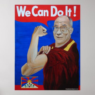
the background is light yellow with a darker gradient on one side, yellow was too powerful to the eye. The liquidity tool was used to make the arm and fist muscle look bigger, plus the waist was given definition. There is a W above the lower oblong war production advert.
less space more focus on the image below, but I liked the above as it was sightly warmer feeling.
both follow the 3rd rule as the women is the central point, plus the WE CAN DO IT IS THE 2nd central point.

this image was cropped so it would have less empty space but i liked the 1st.
1

History background
We Can Do It!" was first printed in American during the 2nd World War and was a wartime propaganda poster produced by J. Howard Miller in 1943 for Westinghouse Electric as an inspirational image to boost worker morale.
The poster is generally thought to be based on a black-and-white wire service photograph taken of a Michigan factory worker named Geraldine Hoff.
However, the poster was rarely seen during World War II. It was rediscovered in the early 1980s and widely reproduced in many forms as you can see from my examples
Describing the image
Female
Showing strength by flexing her arm muscles
Facial expression is serious
Women wearing blue top, yellow background
The hair is wrapped in a red scarf
Text is clear and big, white stands out in dark blue background and had an exclamation mark
Speaking via speech bubble
Poster is in bold colours
Strengths
Its targeting women
Positive thinking for women "We Can Do It!" as a group
The women is speaking via speech bubble
The hair is wrapped in a red scarf show she is ready for a strong work
The poster is showing positive strength which is targeting at women and encourage women to work hard and achieve your goals.
Poster is in bold colours and the woman takes up ¾ of the page and the text ¼ of the page
Not everyone likes yellow
Due to time fashion and colour views change
Not good for men
This is a well known poster of the 2nd world war, at the time when women started to become independent, working and started to earn money and today women are still fitting for their in depended and for their writes and equality. It seems women are doing better them men in some education and job sectors.
Below, Dalai Lama poster has shown him and that same logo WE CAN DO IT! With the exclamation mark plus below on the left hand they have the sun, greenly more like plants and above all their sigh of yin and yang.
the strength of the flex arm he is presenting, say we can do it as a team in spiritual just as muscular strength or as having a stronger positive minds.
strong bold positive colours have been used in the poster below.
Dalai Lama Poster
Chadwick and Spector created the above poster to celebrate Dalai Lama's 70th Birthday in 2005.
This is the 14th Dalai Lama in line
Historically
Dalai Lama the term was used for venerated spiritual masters or heads of monasteries. Today the title can be used as a monk, nun, etc.
lama means chief or the high priest i.e the name is similar to the Sanskrit term for a guru.The Dalai Lama was born in Taktsert, Qinghai and was selected as the rebirth of the 13th Dala lama two years later but was formally recognized as the as the 14th Dalai Lama on 17 November 1950, at the age of 15.
The Dalai Lama a unique mixer spiritual teacher and a political leader. Unlike the Pope he is virtually uncontested as a spiritual inspiration. His attempts at peaceful dialog with the Chinese government but now he is a retired political leader so, he can put all his energy into his spiritual teachings. His attempts at finding a meeting ground between Buddhist philosophy and practice and scientific research is inspiring.
The Dalai Lama a unique mixer spiritual teacher and a political leader. Unlike the Pope he is virtually uncontested as a spiritual inspiration. His attempts at peaceful dialog with the Chinese government but now he is a retired political leader so, he can put all his energy into his spiritual teachings. His attempts at finding a meeting ground between Buddhist philosophy and practice and scientific research is inspiring.
Eddie Adams – Nguyễn Ngọc Loan executing Nguyễn Văn Lém
This image below made Eddie Adams his mark

This image gained its strength after the photo was taken and circulated. It shows the strength General Nguyen Ngoc Loan had during the war. Without fear, he took out his gun and shot the poor week man with his hands tied at the back in cold blood. Year’s later, EDDIE met with General Nguyen Ngoc Loan in hospital and he said,’’ We were just doing our jobs’’.
The strength of this image is the general pointing the gun at the man's head. this shows the power of the general with the gun and the weakness of the man of the man with his hands tied behind him and he is on his own.
Over time it became less shocking and more of a comedy version.
I would say the weakness is, the buildings surrounding the people are all destroyed, there is no one to witness this event to say it is wrong to kill him in war people tend to take the law in one’s own hands and there are no children near.
Historical background
Around noon of February 1, 1968, South Vietnamese General Nguyen Ngoc Loan executed a Viet Cong prisoner on the streets of Saigon. Just before he shot him, photographer Eddie Adams captured the image and even today perhaps it’s the war’s most unforgettable image.
After Nguyen Ngoc Loan raised his arm with the gun in his hand Eddie Adams took the image and then Nguyen Ngoc shot Vietcong operative in the head. He walked over to the reporters and told them that, "These guys kill a lot of our people, and I think Buddha will forgive me." Captured on NBC TV cameras and by AP photographer Eddie Adams, the picture and film footage flashed around the world and quickly became a symbol of the Vietnam War’s brutality.

This is a copy of the above image and over time it became a comedy version, doing the same act with a toy gun.
Modern time and good building in the background and two old men.
BELOW, image by Pablo Bartholomew an Indian photojournalist
he is an independent photographer based in New Delhi, India.
Pablo Bartholomew, has captured a powerful tragedy image of a child, some ones child in, December, 1984.
The child was killed by poison gas after the explosion at the Union Carbide chemical plant in Bhopal, India.

in this image below the main vocal strong points are the open eyes and the open mouth crying out for help
I did not want to write to much about this image but the reason i chose it, was, it shows a lot of painful, sorrow moments as soon as you look at it. Without any words it captures your emotional feelings and you can see what human mankind are capable of.
the 2nd reason i chose it , images like these can make your mark
photographer by Steve McCurry
2

a 12-year old Afghan girl
Describing
main focus point are the eyes
12 year old girl
wearing worn out cloths, but fully covered
shows face and shoulders
no smile or emotional
weakness- there is no background information
eg. it does't show any links to the trauma- therefore it can be any poss image eg, for charity so people can donate money etc.
The eyes hold all the strength of this image, wide open eyes display, terror, horror, shock, emptiness, eyes staring into nothing but fear. The worn out scarf and background are in bold colours. So much fear and emptiness in a 12 year old.
historical background
National Geographic photographer, Steve McCurry shot this iconic image of Sharbat Gula, a 12-year old Afghan girl. She was one of the students in an informal school within the refugee camp and her haunting face, a rarity to be so fully showcased, much less photographed, made it on the cover of National Geographic in 1985. Sharbat’s image captured the imagination of generations the world-over, becoming a symbol of the 1980 Afghan conflict and plight of refugees.

copy of the abve image in oil painting-there was no name of the artist
.jpg)

2nd image 1st image

3rd image
changed the eye colour, colour of the jacket to reddish and the scarf is green plus added some worn out holes to the scarf, made the face much lighter so their would be less redness and changed the tones, contrasts, brightness plus the background.
following the photoshop book was time consuming but did learn a lot and in due course i will learn a lot more.
image- following the 3rd rule - the eyes are the central point, next the bold red background colours.
.jpg)
taking the studio image the lighting was not correct but i did not get a 2nd chance
skyscraper image taken in 1932 workers having their lunch 850 feet above new york.

photograph taken by Charlies C Ebbets.
Description
11 workers sitting on a steel bar having lunch and reading newspaper.
below them are numerous tall buildings
men are wearing caps,
one person is lighting a cigarette
they seem happy without fear of the height
they are not wearing any safety harness
strengths
no fear on the men's faces
relaxed and calm shows freedom
weakness
looks as an unrealistic image because in this time and age you would not see workers on a iron bar 850 feet above ground level having their lunch break, ie they would come back down ground level.
It is one of the most famous photographs ever taken. Eleven construction workers sit and eat lunch on a girder which hovers 850 feet above New York, with nothing to catch them if they fall.
Charlies C Ebbets’ Lunch Atop A Skyscraper, taken in 1932 has become iconic. It is a popular poster and has often been referenced on shows such as The Simpsons and Friends and was used as the cover for The Saw Doctor’s compilation album To Win Just Once.
What is less well known is that two of the men, pictured having lunch on that girder on the 69th floor of the GE Building, were from County Galway. At the extreme left and extreme right of the photo are Matty O’Shaughnessy and Patrick (Sonny) Glynn, who were both from Shanaglish, near Gort in the south of the county.
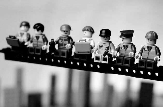
Iconic photographs in Lego
April 4 2008: Amateur photographer Mike Stimpson has recreated some of the most iconic photographs of the 20th century in Lego. Mike spent hours painstakingly re-modelling the instantly recognizable images from around the world using elaborate lighting setups and macro photography
Description
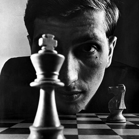
showing a huge face behind a game of of chess
the chess piece in front is a king and there is a king and there is a knight in the background
image is black and white
strength
Bobby fisher is staring at the king thinking, where to move so he the King
the king is smaller than Bobby's face in real life but in the image the king appears to be bigger
the lighting is really good on the king,
the light on either side of the king makes the king look taller and slimmer
weakness
can only seen one play
don't know if he is winning or losing
don't know who the other opponent is or is the king
biography of BOBBY FISCHER
Bobby Fischer was born on March 9, 1943, in Chicago, Illinois. Fischer first learned the game of chess at age 6, and left school at 16 to pursue chess full time. He became the first American world chess champion in 1972, after defeating Boris Spassky. After retiring that same year, he made a comeback in 1992. Fischer became a citizen of Iceland following legal trouble with the United States. He died on January 17, 2008.
Bobby Fischer- my regrets i did do few images copy of the above but to save space on the
USB had deleted it.
David Bowie
6

The cover for “Aladdin Sane” features the famous shot of David Bowie with a painted lightning streak across his face.
Description of the above image
Facial, eye make –up is one side of the eye area
The make –up is striking and unique as a result it is eye catching
No clothes therefore the face is the main features of attraction
Not dress therefore the focus is on the face
The face looks more like a female
Eyes are close; men’s eyes are different from a lady, closing the eyes makes the
Image more of a female
Unisex hair style
Drop of liquid on his clavicle bone
the red bold colour stands out and is eye catching

The above image
The red bold colour stands out and eye catching
Make-up is eye catching
GUSTAV KLIMT
The above painting was painted when he was 45 years old and still living with his mother and two unmarried sisters.
It is considered Klimt's most popular work.

The Kiss
Description
bold colours -green, gold, red, and brown
The lady’s face, shoulder, arms, half legs and feet are fully exposed.
The lady’s eyes, cheeks and the lips have make-up which stands out
The lady's eyes are closed
The man’s face is hidden
Flowers in their hairs
Strengths
The bold colours and gold and brown
The detail of the outfit and the mosaic work
The posture of the couple, the way they are standing on their knee caps on the bed of flowers and green lawn
The eyes are closed shows calmness
No other person or animal in the background
The gold metal used in the image is a stable metal which has a bright yellow colour and the shine does not oxidizing in air or water plus, traditionally considered eye-catching on women and linked with love, wealth and beauty.
The lady’s face, shoulder, arms, half legs and feet are exposed show beauty
weakness
Can’t see any weakness maybe because I have great passion for this work
historical background
The Kiss, in German, Der Kuss was painted by the Austrian Symbolist painter Gustav Klimt between 1907 and 1908, known as his "Golden Period", he painted a number of works in a similar gilded style.
A perfect square, a couple embracing, their bodies tangled in elaborate robes decorated in a style influenced by both linear constructs of the contemporary Art Nouveau style and the organic forms of the earlier Crafts movement.
The work is composed of conventional oil paint with applied layers of gold leaf, an aspect that gives it its strikingly modern, yet evocative appearance.
The painting is now in the Österreichische Galerie Belvedere museum in the Belvedere palace,Vienna.
About - Gustav Klimt
He was a man who was drowned towards beautiful red haired women, i.e. had a sexual appetite, like some people have love and appetite for food.
Behind the respectable disguise man, he was a man with a ferocious sexual appetite; he fathered at least three known illegitimate children.
The Kiss reflects his fascination with eroticism and architecture broken pieces of mosaic works.

Klimt’s first version of Adele
Klimt’s has used dazzling layers of heavy gold and silver paint with smooth and flowing brush strokes, and bold geometric shapes making this image both an intricate and unique portrayal of the refined of an upper-class woman. His work was seen at the beginning of the 20th century and was highly graded.


these 3 above images of plant and face flouting are experimental work that i tried to create tile effect work similar to KLIMT,S work of the kiss but used the fish example in the water, as it was experimental.
the photo was of my face and the rest was carried out in Photoshop.

Using People, by Alan Craig
The above image is of Lucille Ball
created by Alan Craig using people.
The image has a white background and people dressed in all black or all red cloths. There are people standing at various places, some are spread apart and some are close together plus some are bending, stretching their arms out etc. There are some people also dressed in all red to create the red lips and give it that little more detail to the image.
The people dressed in all black are there to create shadows on the white background and their main purpose is to create an image of Lucille ball the actress.
A lot of time and effort must have gone into creating this unique above image and i believe it is taken from the air maybe from the right lower side, so the curves of the lips and other detail can be seen.
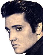
The other images using people e.g., Elvis Presley and Marilyn Monroe are created in a similar way.

The above image is of Lucille Ball
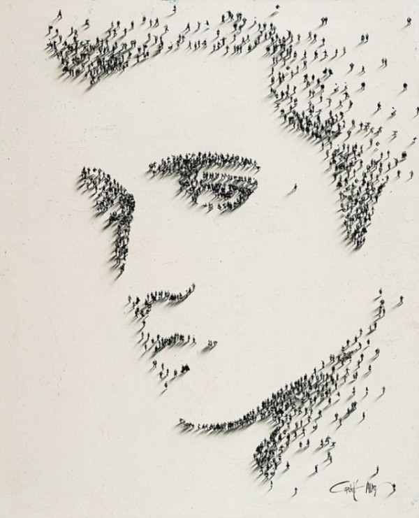
Elvis Presley
Elvis Presley
4
this is a image of Marilyn Monroe
and below is the copy image created by Alen Craig using people.

by Alan Craig
Alen Craig recreates famous iconic images of famous people eg, Elvis Presley, Lucille Ball etc. He uses people that are wearing black cloths so contrast can easily be created on white background and on selected areas some people wear colour cloths eg the lips.

a painting is by Andy Warhol created in Photoshop
3rd image

3rd attempted
after using the artistic tool the colours and shades were changed. More yellow was added on the hair and lip colour plus it is important one knows were the light tones fall and the shades fall on the image, because when you change an image then it does not look odd. however there was another tool used in the book i could not find it in Photoshop.
Her hair is less yellow than Marilyn Monroe, making it to yellow did not look so realistic plus i kept the extra noise because it made the image look good.
following the 3rd rule, the eyes are the main central point and the lips are the 2nd central point. space wise there is little space so more emphasis is on the total face.


first attempt 2nd attempt
these two image have a newspaper look around the edge of the lady, this is due to i wanted the image look as the cartoon image is cut out of a newspaper and glued on a bronze background. Her hair was coloured yellow so it would look like Marilyn Monroe

5

Digitally Recycled Recreations ~ Hope by Petrus Boots ...
4th image
i am happy with the results below as it was my 1st attempt and it was time consuming.

the above image has more space on the right side and more shadows darkness, this is due to she lady is staring into the distance and is on her own.
On the left side there is more space and the subject is the central point plus the window frame is the horizon lines

the original used for the above
Mona Lisa by Leonardo da Vinci
6th

Mona Lisa
The background shows the sea and land and yet the woman is sitting on a chair in a studio becase she is resting her arm and hands on the arm rest of the chair.
delicate smile on her face and is looking right at the viewer and is very relaxed.
it shows in those days paintings had very little smiles or teeth showing.
You can see her natural beauty and the natural beauty of the sea and the undisturbed land behind her. The woman dose not seem to have any make-up on. The painting of her hair is so well painted that each hair strands and curls can be seen. She is not resting on the back of the chair but sitting up right, yet she is very relaxed and this can be seen the way her arm and hands are resting on the arm rest of the chair.
History background
The Mona Lisa ( Lisa Gherardini, wife of Francesco del Giocondo) is a half-length portrait painted by the Italian artist, Leonardo da Vinci.
The painting is thought to be a portrait of Lisa Gherardini, the wife of Francesco del Giocondo, which is in oil on a poplar panel.
It is believed the painted was painted between 1503 and 1506. It was acquired by King Francis I of France and is now the property of the French Republic, on permanent display at the Musée du Louvre in Paris.


Copy of mona lisa.
Lots of tools were used which I followed on two books i.e., instruction on photshop
it was time consuming due to the fact following instructions and learning is not easy but after attempts on colour and cloning colour, even Richard could not find a good face colour match.
it was a good attempt and score myself 8.5 out of 10
5th image

2nd attempted much better
i would scour myself 9.5 out of 10
HOWEVER,i should have made the body a little slimmer so the face would fit better or make the face round, but making the face round would change the person,s face.
21ST century
Autum tree in the desert with spikes, below
6th, the 3 jig-saw images

the above is a Autumn painting with the spikes coming out of the leaves
This is a painting of the tree leaves with spikes coming out of the leaves. It is an autumn painting growing in the desert with the peachy coloured sand and under the peachy sand, where no light can penetrate the ground is black.
The leaves on the tree consist of different colour sections of grey and orange/ browns. Some of the orange/brown leaves are more orange and some are more reddish. The spikes are the same colour as the section of the leave were it is growing from.
From the right side corner of the image L shapes of blocks are forming, coming into view with the grey background. The pieces are getting bigger and four corner blocks are forming with spikes coming out of leaves i.e. the seeds.
Once the spikes have been formed into seeds. The seeds fall of as circles and then they form into stars, as you can see the fully formed seeds has spikes which gives a clue of the fully grown leaves of the tree.
SUN-ENERGY FLOWING FROM GROUND INTO YOUR LIFE
HOPE
The sun has set half way
SUN-ENERGY FLOWING FROM GROUND INTO YOUR LIFE
HOPE
The sun has set half way


above, this is the bright and background is green where there is hope life and green land. the circles, triangles etc shapes are spread out and peaceful.
the above 3 images
were ideas taken from W.KANDINSKY and JACKSON POLLOCK.
below is a painting W. kandinsky which inspired me to to the above 3 pieces of work.

the above is by Wassily Kandinsky
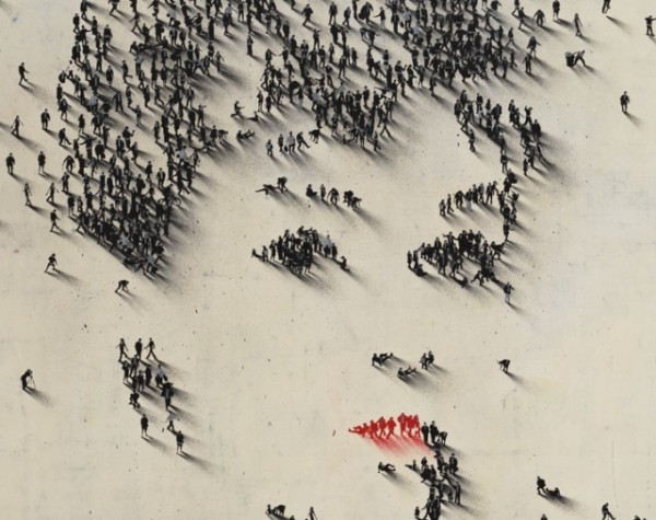
Pablo Picasso's work

this image is unique has been painted in 3D and Pablo was probably the first to paint in 3D. In this painting he uses bold colours and it stands out, He also uses lots of shapes for example, triangles, curves, lines, and different colour a little like patch work.
The lady is in a small room with the 2 corner of the room and she is sitting on a chair with her arm resting on the arm chair just like in the Mona Lisa painting.
The face has no patch work colours to it or the eyes, it seems the face is the main focus point with the noise pointed more like beak.
This painting is more like the beginning of the cubic period.
This above images is what modem painting is more of and a lot what to day and less of oli painting eg Mona Lisa.

12
below, Self-Portrait of, by Vincent van Gogh
1889
13
Vincent van Gogh was a artist and he had painted many his self portrait. In this particular portrait he looks serious yet he is looking right at you. His self portraits always has one ear present and never two and this can be due when he is painting his own face he can't see his whole face.
He look's as if he is in his 50's with some grey hair present and wrinkle on his face.
The background is light calming like the waves of the sea.
below is a copy of the above, it is good the way the painting on the 3D human has changed to 2D, except the eyes and the shirt has not been painted on. Therefore the eyes are always is the drawback as you can't paint over the eyes.

Vincent van Gogh
A copy painting on a person by Alexe Meade
Above is a painting of a 3D into a 2D image by Alexa Meade in,vented a painting technique called trompe-L 'Oeil that can perceptually compress a 3D into a 2D image, therefore instead of doing a full painting of a person on the canvas Alexa painted on a person's face so it looks as a 2D image on a person who is 3D.
see image above and below
14
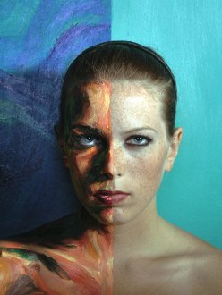
in this above case only half of the face has been painted and half left unpainted so we can see the difference.
wanted to do this and there are two ways
1- paint the face with body paint
2- paint in Photoshop to get a similar image results but, best would be buy body paint.
below is the face of Jean Shrimpton are in the cover of BAZAAR magazine
15

Jean Shrimpton (Nov. 7, 1942) Shrimpton was a sensation almost immediately when she started modeling in 1960 and is perhaps the world’s first supermodel. One of the most iconic faces and bodies of the 1960s, her slim figure earned her the nickname “The Shrimp”
below is my first changes made
7

original

changes made in photo shop to create
the one below
7th image created

this was my first image and only had less than 5 minute to take it, it was good to work with what i had as i did learn more how to put it correct. However if the lady head was slightly higher it would have been better
Mr Heine – Johnny Depp's Alice in Wonderland
below is digital circular portraits by BEN HEINE

wanted to do the above image with large and small circles on the face but, needed to do lot more research on it and could not find a book due to time
research work for my A or B images
to create shadow and make little people out of paper and take a picture, but l did not do it in the end but will do it at another stage.

A the above image is a traditional silhouette portrait of the late 18th century
A silhouette is the image of a person, an object or scene represented as a solid shape of a single color, usually black, its edges matching the outline of the subject. The interior of a silhouette is basically featureless, and the whole is typically presented on a light background, usually white, or none at all.
http://en.wikipedia.org/wiki/Silhouette

Learn how to make a shadow puppet with these step by step instructions, along with ideas and resources about shadow puppets and shadow puppet theatres!
the above image is a puppet shadow
Learn how to make a shadow puppet with these step by step instructions, along with ideas and resources about shadow puppets and shadow puppet theatres! Shadow puppetry is believed to have originated from China over 2000 years ago. Modern shadow puppetry know a days use computers or film to create impressive shadow.
above is practice and research work
i did not get round it, hopefully i will at a later stage while on the course.
working with people
i wanted to create the people image like ALAN CRAIG had taken images from the air, i planned to make a shadow via light and stick little black tissue paper people on a white paper and take the image from and angle so it would create shadows but due to time, being ill and not buying the paper i did not get round it, hopefully i will at a later stage while on the course.